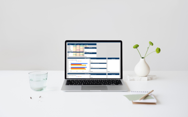
infographic: DIGITAL DASHBOARD

This editable template more effectively visualizes data in order to foster reflective and actionable data-driven conversations.
My Role: E-Developer, Data Facilitator
Tools Used: Google Sheets
the challenge
Team members were required to effectively analyze and reflect upon demographic data trends during quarterly data-driven conversations with a supervisor in order to promote equity and inclusion.
The original table design, while providing important information, did not use data-facilitation techniques to support the analysis of these numbers (see Table 1).

the solution
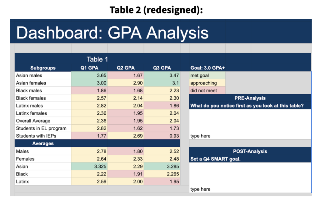
By using a heatmap, a key, and guiding questions (see Table 2), team members were better able to draw inferences from the data.

Horizontal Bar Graphs were added to effectively visualize trends. The additional notes column was added to promote collaboration in the event this data analysis was done in a group setting.

A Line Graph was chosen to best visualize the complex intersections between multiple variables.
